(D_IS.01)
’026
Dana Tamir
/ART&TECH
Designing a visual discomfort research experience
Services
Visual identity
Print materials
Interactive design
UX / UI
(K.01)D/IS
Designing a visual discomfort research experience
The gap between seeing and understanding.
DIS is a speculative research lab exploring visual discomfort and how perception responds when familiar visual systems become unstable. The identity focuses on disruption, disorientation, and the gap between seeing and understanding.
I developed the project as a complete visual and interactive system, including branding, UX/UI, print and social materials, motion design, and a two-part experience combining interactive projection, real-time tracking, and an immersive first-person game.
(01)
/Logo
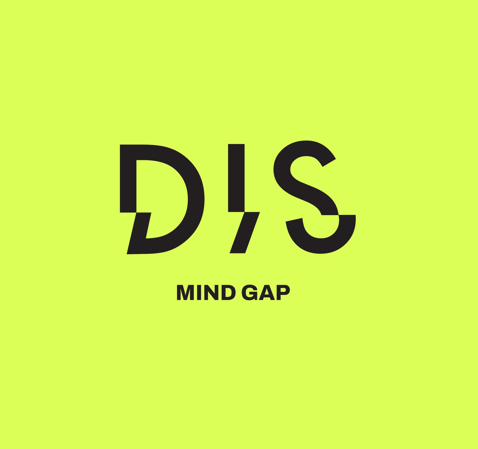
DIS is cut where the eye loses its grip. Each letter is sliced at the same height and the lower half slips out of place, so the word reads as one frame lagging behind the next. In the I, the shift becomes a slash, a small gap in perception built into the name, answered by the tagline “Mind Gap”. Every distance in the lockup is a whole multiple of one base unit, giving three fixed ratios: stacked 3:2, horizontal 3:1 and mark-only 2:1.
Logotype · Grid system · Lockups
(02)
/Merch
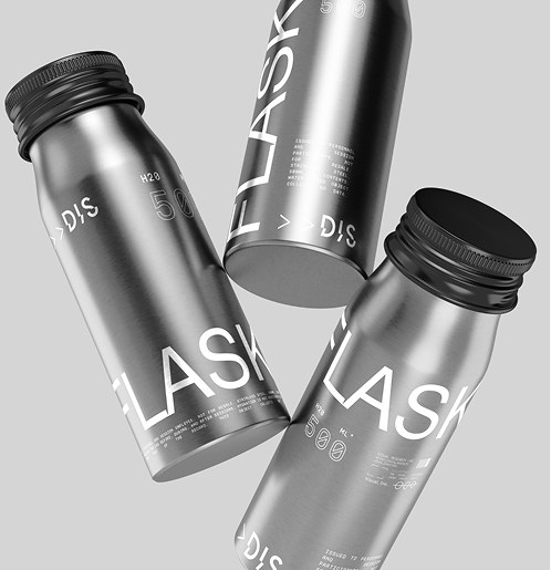
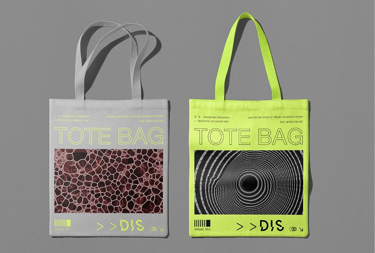
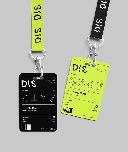
Lab issue for staff and participants: aluminium flasks, tote bags and ID badges that carry the identity off the screen.
Flasks · Tote bags · Badges
(03)
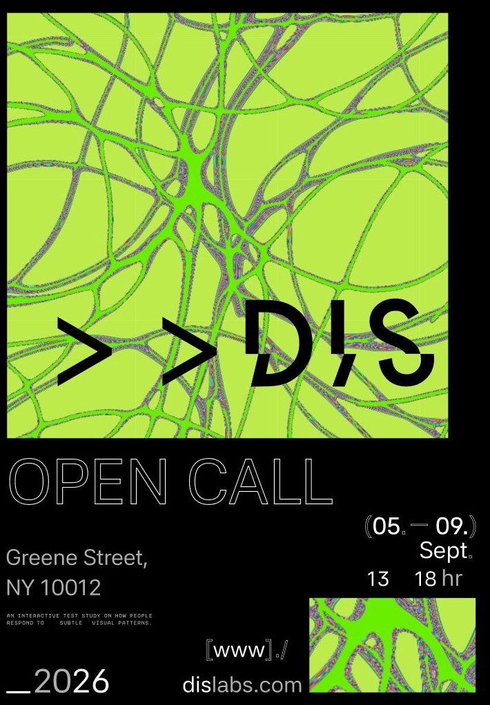
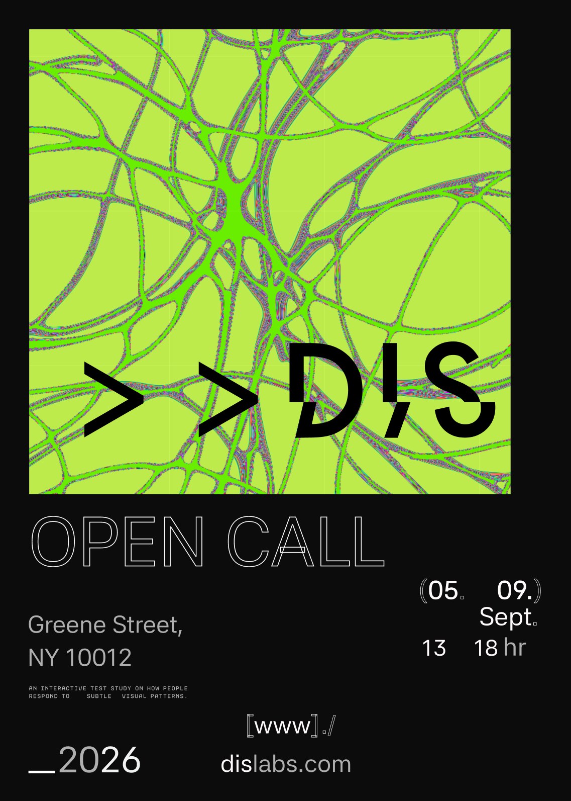
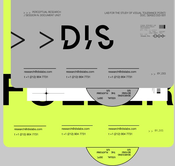
An Open Call poster for the study and a lab folder with business cards: the same grid, the same lime, the same gap.
Poster · Folder · Stationery
(04)
/Packaging
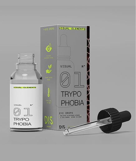
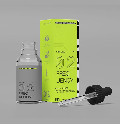
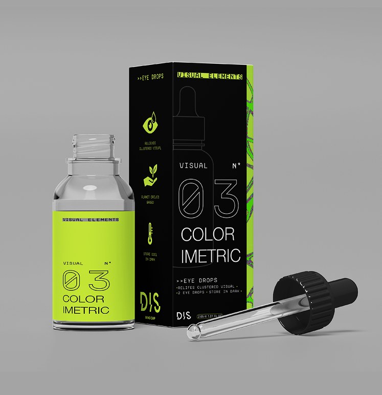
Eye drops named after the visuals they “relieve”: Trypophobia, Frequency and Colorimetric. One system, three colourways.
Bottles · Boxes · Labels
(05)
/App
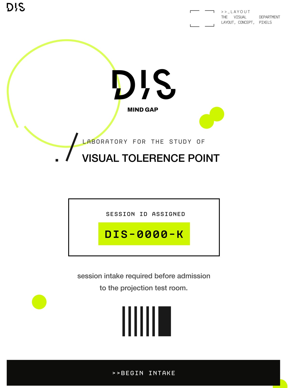
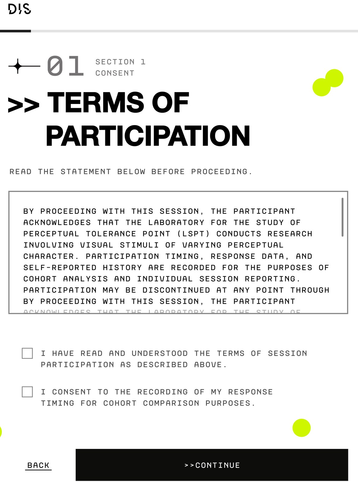
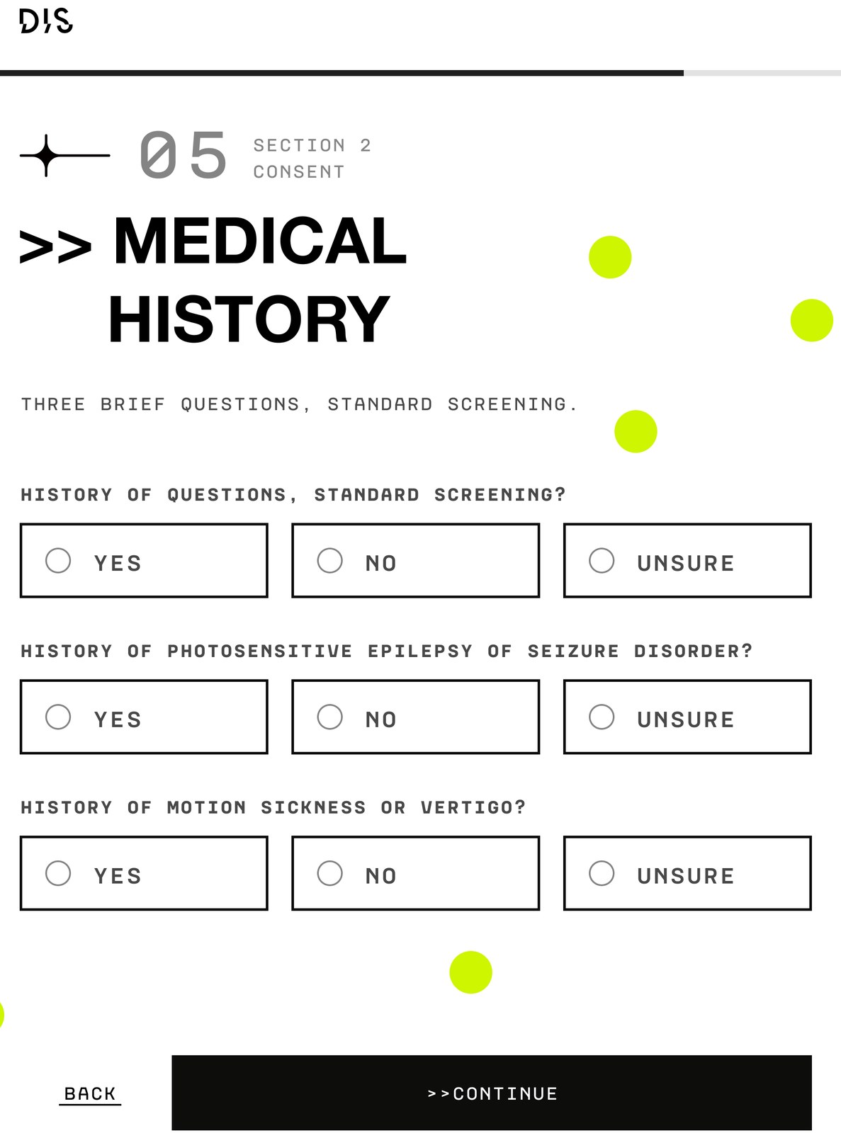
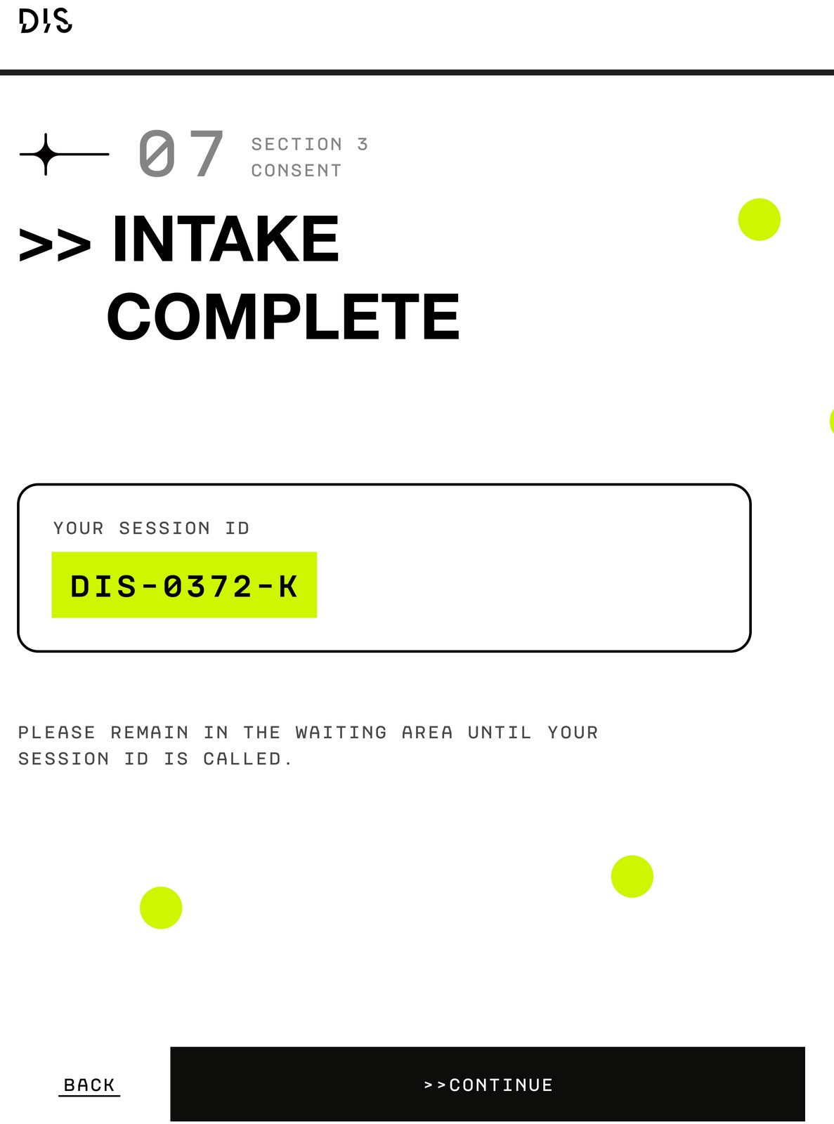
A tablet intake app before the session: consent, a short medical screening and a session ID that calls you into the projection room.
Tablet app · UX/UI
(06)
/Installation
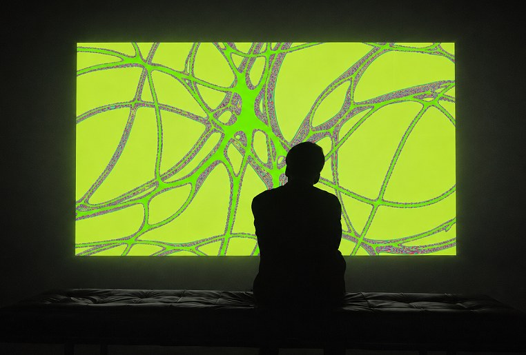
An interactive projection that watches back. A camera tracks the viewer’s face and eyes in real time, and the image responds to every glance: patterns shift, tighten and break apart as attention moves. The longer you look, the more the room reacts, until the moment of discomfort becomes part of the work.
Interactive projection · Real-time tracking
(07)
/Website
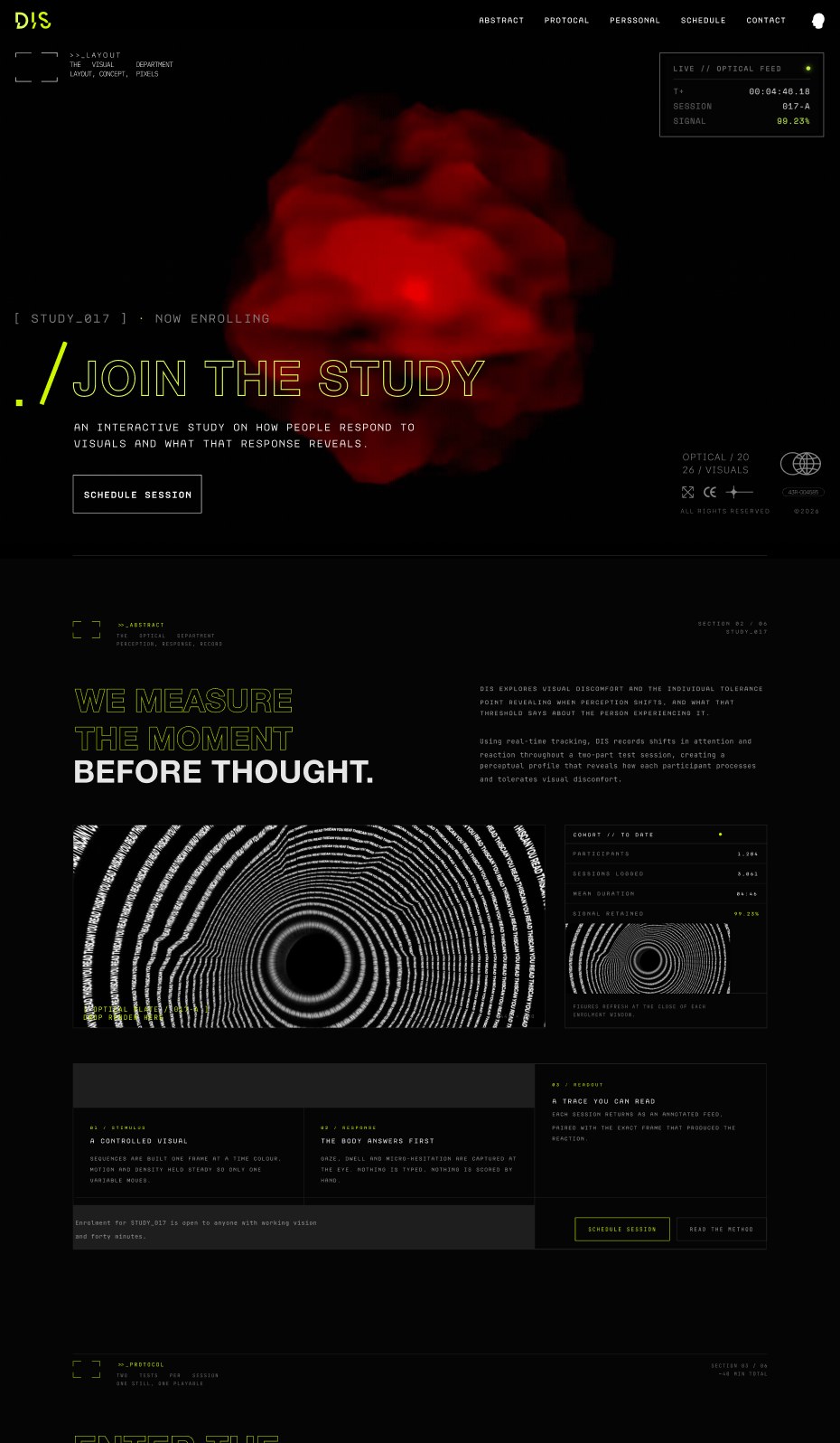
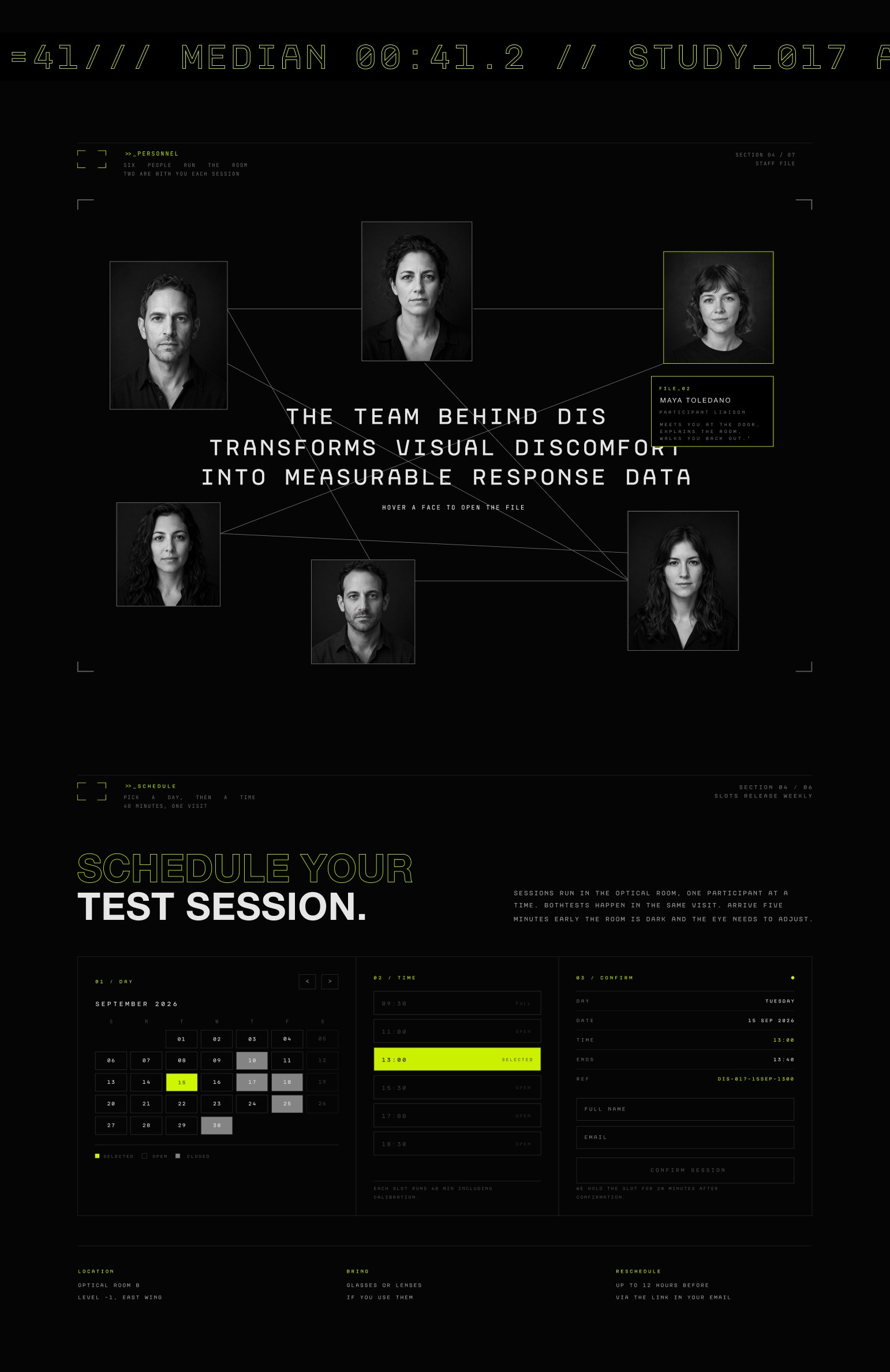
A recruitment site for the lab: join the study, meet the team behind it and book a test session.
Web · UX/UI · Booking flow